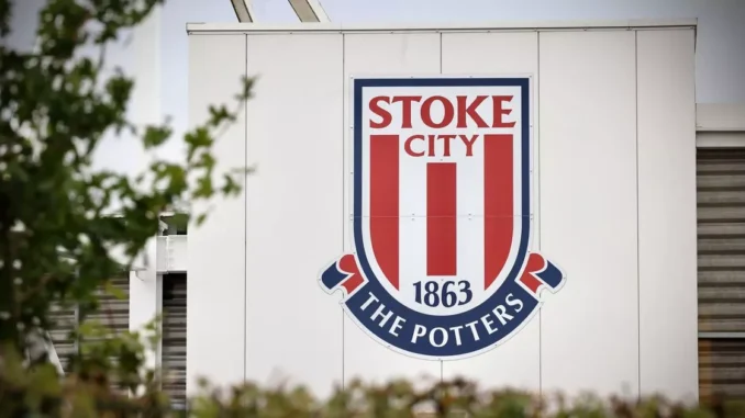
Badge Revolution Begins! Stoke Tease Design Overhaul
Badge Revolution Begins! Stoke Tease Design Overhaul
More than 5,000 Stoke City supporters have joined in consultation about potential changes to the club badge – and given a clear steer about what they want and don’t want in any new design.
A total 81 per cent of fans who took part in initial surveys said they were open to the idea of a new badge in the first major review of the crest that was introduced back in 2001.
Further research has found that the badge that was worn on shirts between 1977 and 1992 was “comfortably the most popular” of the four which have been used by the club over the last 70 years. The kiln and Staffordshire knot, which were part of that badge, topped the list when supporters were about favourite iconography.
In terms of shape, there was “a clear preference” for a shield and if there had to be a third colour used beyond red and white, black was “by some distance” the most popular.
In regards to typography, it was Stoke City or Stoke City FC that was favoured over SCFC while there is clearly clamour to have ‘Vis Unita Fortior’ and ‘1863’, the year of the club’s foundation, as part of the design.
Stoke have been asking supporters for their opinions by holding fan assemblies, asking supporters at the stadium on match days and via online surveys.
The feedback will now be used to inform the design process before initial concepts are shared in the next phase of consultation, which will be after the 2024/25 season has ended. A final design will ultimately be put to supporters for a decision this summer.
If fans do vote to change the crest, the new badge will appear on kits for the 2026/27
Get more related news on: https://sportviewers.com

Leave a Reply